Adaptive Design in Flutter Web
Photo by Hasmik Ghazaryan Olson on Unsplash
There is a big shift when we change from mobile to web development:
Where in mobile development we had a specific set of devices in which our app could run… On the Web, our app could be displayed anywhere. From a tiny display to a New York Billboard, an ultra-wide screen, or a mobile device. But even more! Our users can change the window size at any time in a desktop computer, to make it larger or smaller, so we can’t even rely on retrieving the current device type or operative system.
This means that now we must try to figure out how to give the best experience possible for the user, depending on the available space of the screen.
One of the solutions that have been in the Web design of many websites for quite some time now is Adaptive Design. In this article, we will see what adaptive design is and how we can use it in Flutter.
Adaptive Design
Users expect different behavior when they use different devices.
Let’s take for example e-commerce websites. On a desktop computer, we have a big screen that allows us to see more information. So some websites opted to create a dropdown list in which we can use our computer’s mouse to navigate between different product sections.
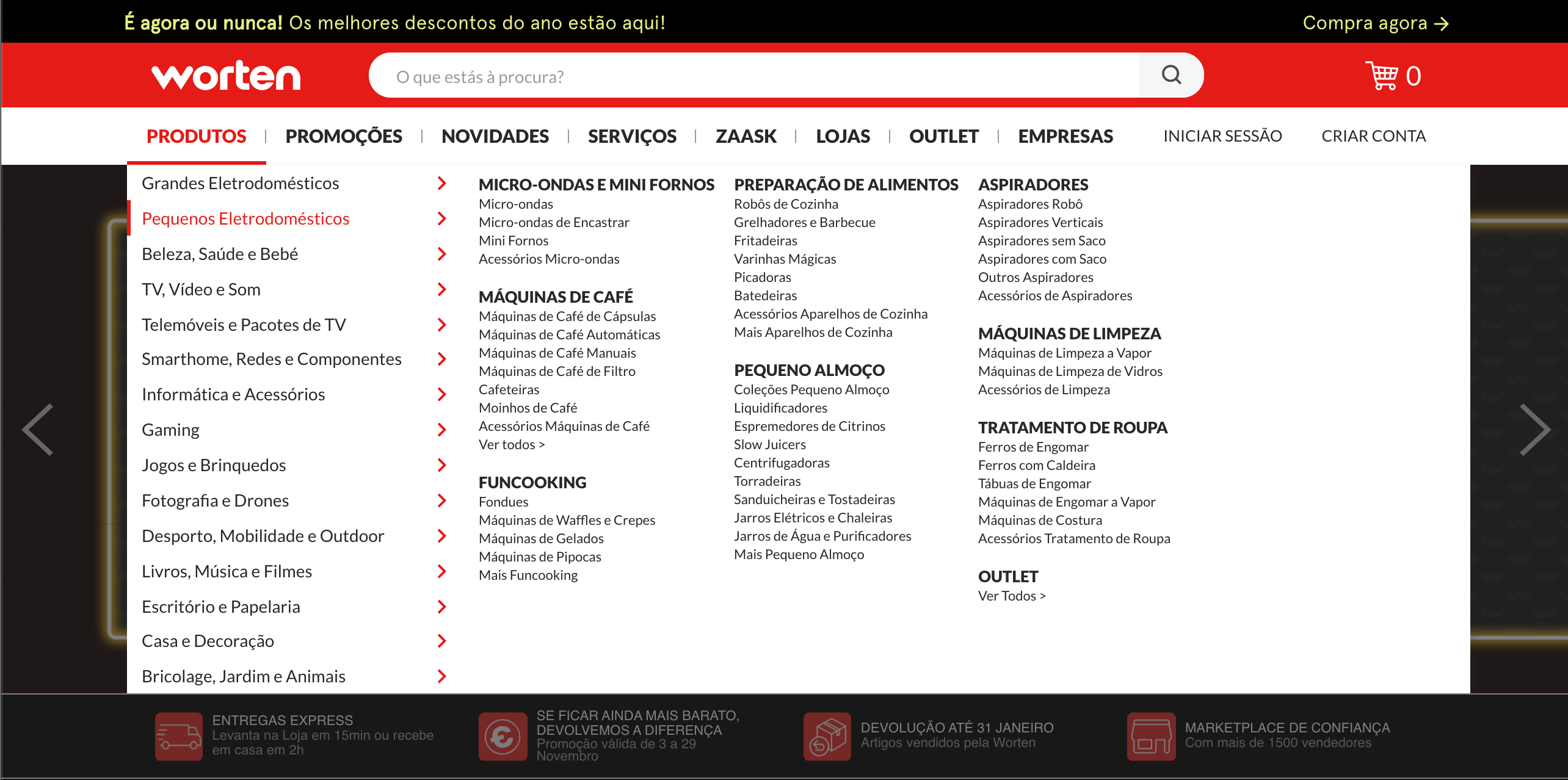
Mouse-hovering other sections on the list on the left will present different information on the right.
But, if we are talking about mobile devices, no action compares to hover - users can only click to see more content. And even more so, they won’t have the same width of the screen so it won’t be feasible to display that much information. That is why websites tend to change the top navigation bar to a navigation drawer as we have in native Android applications:
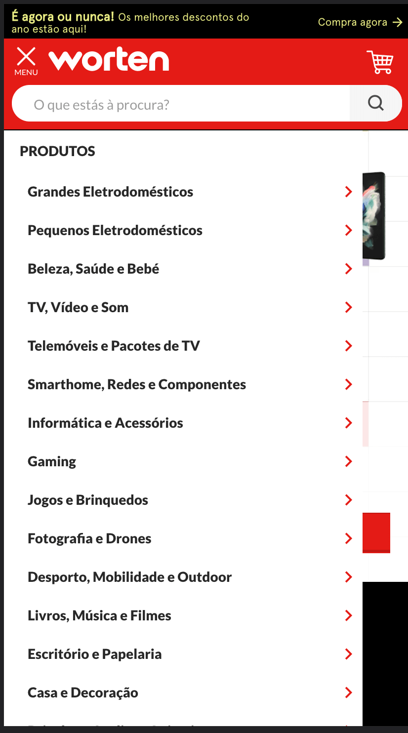
Here, to see the contents of a new section we have to click on one line to display new content in the drawer:
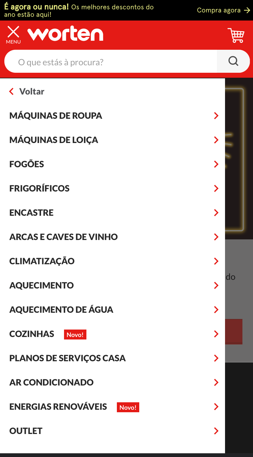
With a newly added option “Voltar”, which translates to “back”, allowing users to return to the original list of categories.
And it’s not only the navigation bars that can change from design to design. We can adapt our design so that in a desktop computer it shows more information and the user can more quickly do actions, and in mobile devices show a more condensed view, using the same design philosophy we see in mobile applications.
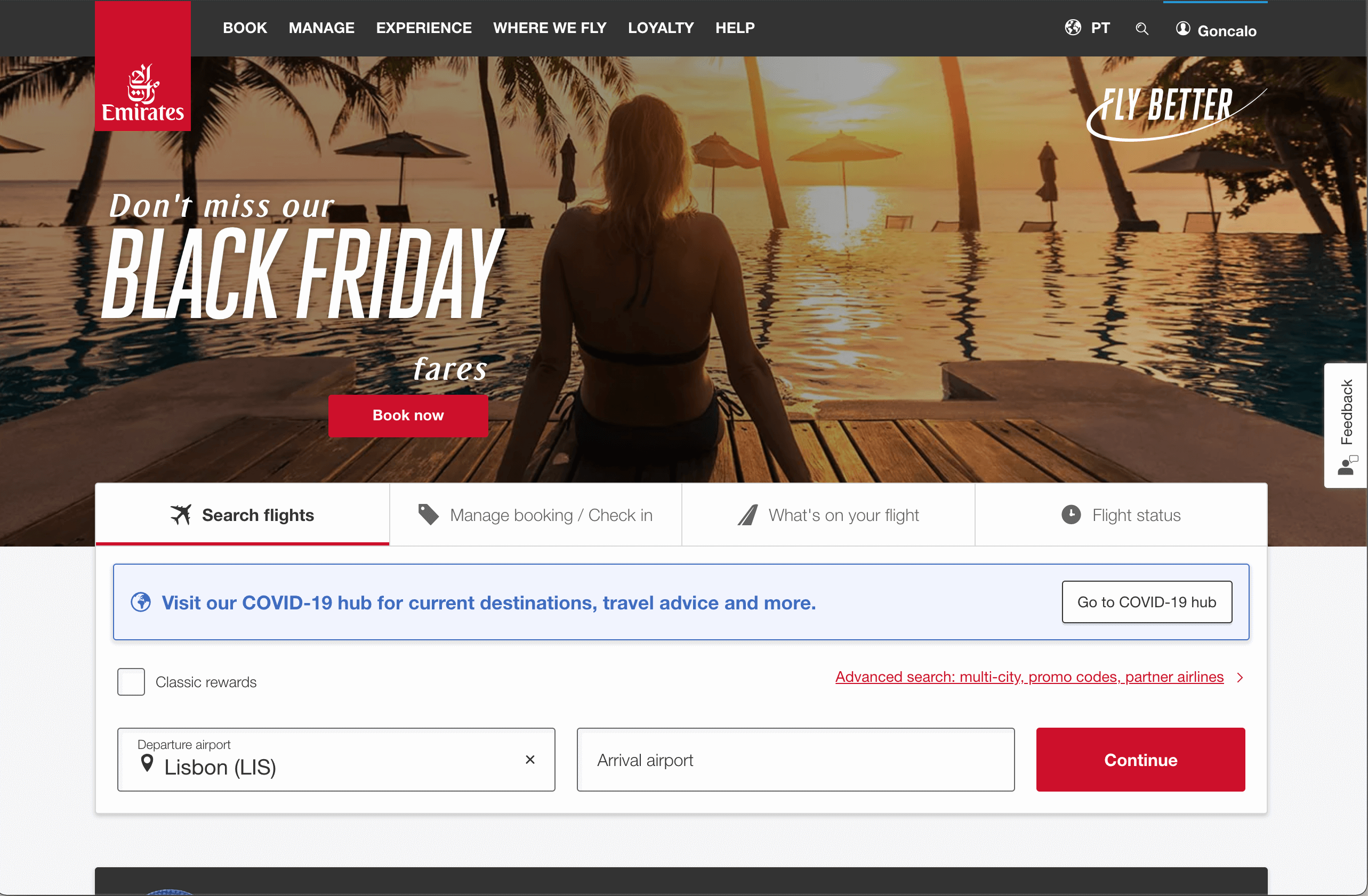
This is exemplified in Emirates.com website, wherein the wider version we can search for flights directly:
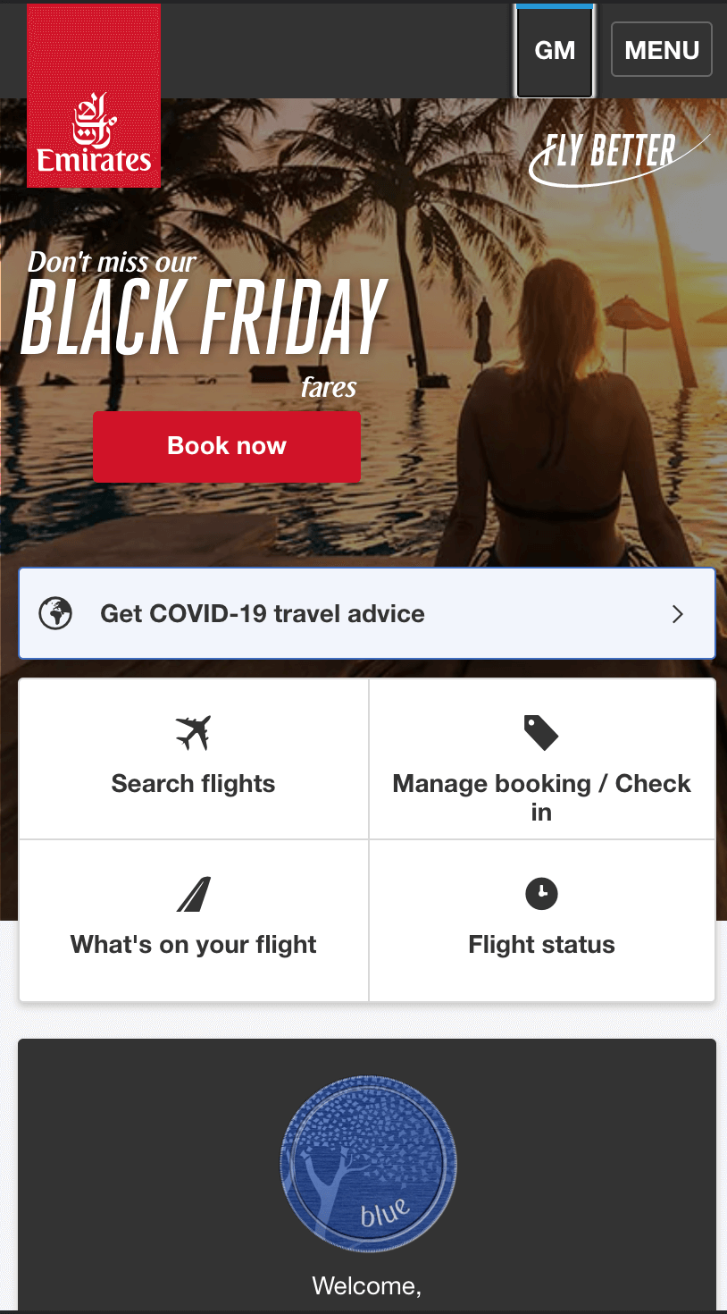
But in the mobile counterpart we will have to click first to navigate to that option:
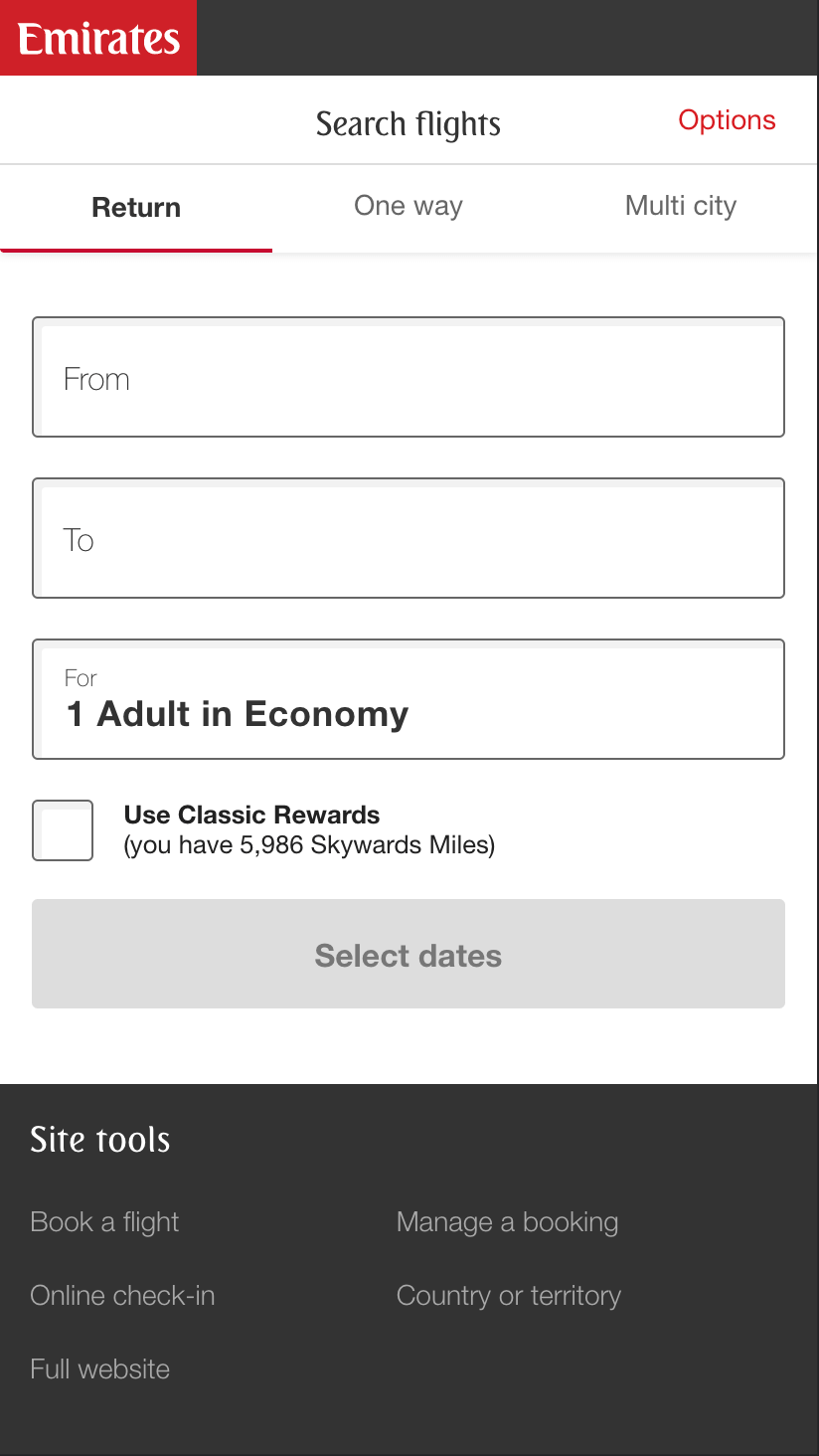
Which will navigate us to the search flight page:
This means that not only did we change the design but we also changed the user experience:
- On a desktop computer users can search for flights, putting dates and destinations on the landing page
- In a mobile device, users will have to click on “Search Flights” and they will be redirected to a different page.
And this is exactly what we have to keep in mind when we create Web Applications using Flutter Web - we should be able to provide the best user experience possible for our users, playing with the strengths of the design of desktop, tablet, and mobile applications.
Adaptive Design in Flutter Web
Before we create any Flutter Widget, we need to think about the problem itself that we want to solve.
In a summary:
We want to be able to provide to our users different UI (user interfaces) and UX (user experience) depending on the available width of the screen.
This means that there will be breakpoints that will divide the designs.
As soon as we have the breakpoints, we will need to find a way to get updates whenever the window’s width changes and we rebuild the UI when needed.
We can then tackle the problem in 3 steps:
- Decide how many breakpoints we need, each corresponding to a device type;
- Create a function to get the device’s type width according to the current window’s width;
- Create a builder function that will give as an argument the device’s type and builds different child widgets.
Design breakpoints and Dimensions in Flutter Web
We define a breakpoint as the width that divides two different UI experiences.
They cannot be arbitrary since they need to be translatable to something more or less tangible, for example, we define a breakpoint that any device with a width larger than 1920 is a desktop computer.
But, if we look at the specification of Apple’s iPhone 13 we see that it has a resolution of 1170 x 2532 pixels, so does that mean that if the device is in landscape mode we show the desktop view? Does it make sense?
The reality is that the resolution pixels of our devices are not what Flutter takes into consideration when calculating the available width. Flutter uses logical pixels which are device-independent pixels. To calculate it we have to divide the window’s width by the device pixel ratio. Fortunately, WidgetsBinding has access to both variables, so we can easily calculate it using the following formula:
double? get _width => WidgetsBinding.instance != null
      ? WidgetsBinding.instance!.window.physicalSize.width /
          WidgetsBinding.instance!.window.devicePixelRatio
      : null;
Now that we have a way to calculate the current width that takes into consideration the device’s width and pixel ratio, we can think again about our breakpoints.
However, instead of reinventing the wheel, we can see how other frameworks in Web managed to solve this, and one great example of that is Bootstrap which defines different breakpoints for different devices:
| Breakpoint | Class infix | Dimensions |
|---|---|---|
| X-Small (Smaller mobile devices) | none | < 576px |
| Small (mobile devices) | sm | >=576 px |
| Medium (tablet devices) | md | >= 768px |
| Large (small desktop computers) | lg | >= 992 px |
The question is - what do we want to present in our application?
Let’s say that for the case of this article we want to display two different designs: mobile and desktop.
In that case, we’ll define two breakpoints:
- mobile for when the width is <= 700 px
- Desktop when the width is > 700 px
To translate this into code, we will:
- Create an
enumwith the different device types - Create a function that
gets theenumvalue depending on the window’s width
enum DeviceTypeEnum {
  mobile,
  desktop,
}


DeviceTypeEnum get _getDeviceType {
  if ((_width ?? 0) < 700) {
    return DeviceTypeEnum.mobile;
  }
  return DeviceTypeEnum.desktop;
}
This means that whenever we get the current window’s width, we’ll be able to decide what type of device we should currently render.
Creating the Adaptive Widget
Now that we’ve stipulated our breakpoints, we just need to create a Widget that will be aware of any changes to the app’s Window.
Thankfully, we can use WidgetsBinding again for that, in this case, the WidgetsBindingObserver.
This observer is a mixin that allows us to override didChangeMetrics, which is called every time that the window changes size.
This means that:
- We need to create a widget that uses the
WidgetsBindingObservermixing - Our widget will listen to
didChangeMetrics - It will decide what’s the current
DeviceTypeEnumdepending on the calculatedwidth - It will set a new state and call a builder:
enum DeviceTypeEnum {
  mobile,
  desktop,
}

/// Builder Function
typedef AdaptiveWidgetBuilder<DeviceTypeEnum> = Widget Function(
    BuildContext, DeviceTypeEnum);

class AdaptivePageBuilder extends StatefulWidget {
  final AdaptiveWidgetBuilder<DeviceTypeEnum> builder;

  const AdaptivePageBuilder({
    required this.builder,
    Key? key,
  }) : super(key: key);

  @override
  State<AdaptivePageBuilder> createState() => _AdaptivePageBuilderState();
}

class _AdaptivePageBuilderState extends State<AdaptivePageBuilder>
    with WidgetsBindingObserver {
  @override
  void initState() {
    super.initState();
	  /// Registers the observer
    WidgetsBinding.instance?.addObserver(this);
    /// Schedules a first `didChangeMetrics` to decide on the device type
    WidgetsBinding.instance?.addPostFrameCallback((_) => didChangeMetrics());

    /// Attempts to get initial device type
    _currentType = _getDeviceType;
  }

  late DeviceTypeEnum _currentType;

  /// Calculates the device-independent width
  double? get _width => WidgetsBinding.instance != null
      ? WidgetsBinding.instance!.window.physicalSize.width /
          WidgetsBinding.instance!.window.devicePixelRatio
      : null;

  /// Decides which UI we should show depending on the width of the screen
  DeviceTypeEnum get _getDeviceType {
    if ((_width ?? 0) < 700) {
      return DeviceTypeEnum.mobile;
    }
    return DeviceTypeEnum.desktop;
  }

  /// Calculate the new width of the screen and, if necessary, change
  /// the current device type
  @override
  void didChangeMetrics() {
    final newType = _getDeviceType;

    if (newType != _currentType) {
      _currentType = newType;
      setState(() {});
    }
  }

  /// Builds the children with the given BuildContext and the DeviceTypeEnum
  @override
  Widget build(BuildContext context) {
    return widget.builder(context, _currentType);
  }
}
Now that we’ve done the bulk of the work in the AdaptivePageBuilder Widget we can easily use it by just returning different Widgets depending on the current DeviceTypeEnum:
class HomePage extends StatelessWidget {
  const HomePage({Key? key}) : super(key: key);

  @override
  Widget build(BuildContext context) {
    return AdaptivePageBuilder(builder: (context, type) {
      if (type == DeviceTypeEnum.mobile) {
        return const MobileHomePage();
      }
      return const DesktopHomePage();
    });
  }
}
With the result being the following:
Conclusion
As we’ve seen in previous articles already, when we change from developing only for mobile devices to start developing for the Web, we need to adjust to a new paradigm.
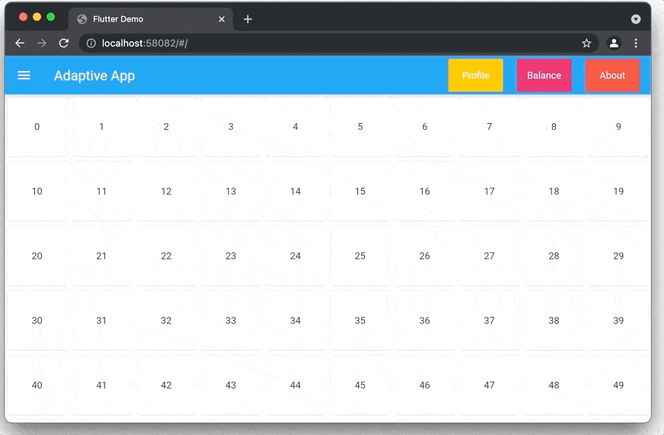
In terms of adapting our apps to multiple screens, we can choose to create an Adaptive Application, which will display a different UI and UX depending on the current size of the window. This can be seen in the previous image:
- On Desktop we have an app bar with buttons to easily navigate to new sections, and our content is displayed in a large grid
- On Mobile we have our content displayed in a List instead and we use a Bottom Navigation bar to navigate between different screens.
So in essence, it’s combining a desktop and a mobile application in a single Web application, and we can access each one by changing the current size of the screen.
When opting to create an Adaptive application, the key is to create Widgets that can be heavily reused, so that we don’t have to create the same components for desktop and mobile over and over again.
Next week we’ll tackle even more web challenges to make our apps look and feel like a native web applications.
The code for this project is hosted in Github at: https://github.com/Vanethos/flutter-web-adaptive-design
Want to get the latest articles and news? Subscribe to the newsletter here 👇
And for other articles, check the rest of the blog! Blog - Gonçalo Palma